Sunset Senior Communities – Showcasing Active Senior Living
As one of the largest Christian-based nonprofit organizations in West Michigan, Sunset Senior Communities is dedicated to providing high quality and compassionate senior services that care for each residents’ total well-being. Over the years, the organization expanded to include four different campuses, a Legacy Foundation, a Meals at Home program, and more. They needed a partner to create a consistent brand and a comprehensive marketing strategy to bring alignment and awareness to the organization as a whole.

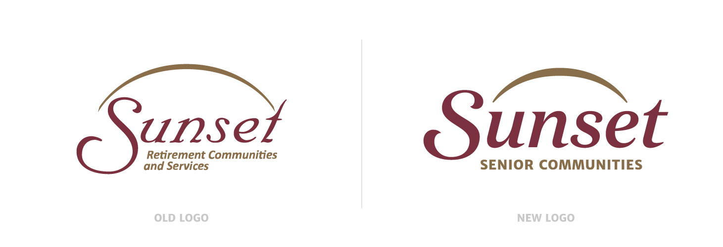
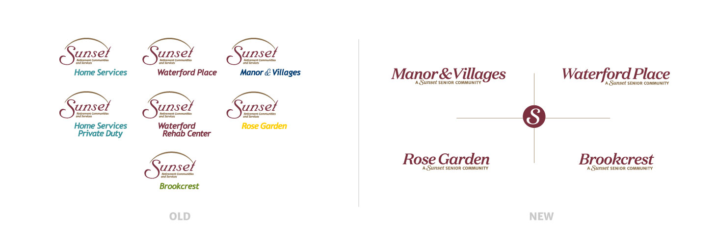
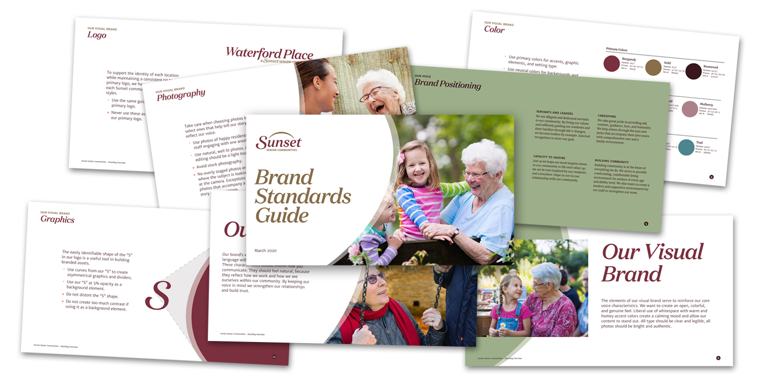
Visual Branding Update
After an extensive Discovery that included multiple in-person meetings with staff, volunteers, and residents, as well as market research and informal community surveys, the DVS team ascertained that Sunset, then known as Sunset Retirement Communities and Services, needed to reposition itself as a strong and experienced provider in senior care. With a true focus on people, Sunset needed to communicate its purposeful brand story (care, culture, and educational resources) to its target audiences and the broader community.
New Website
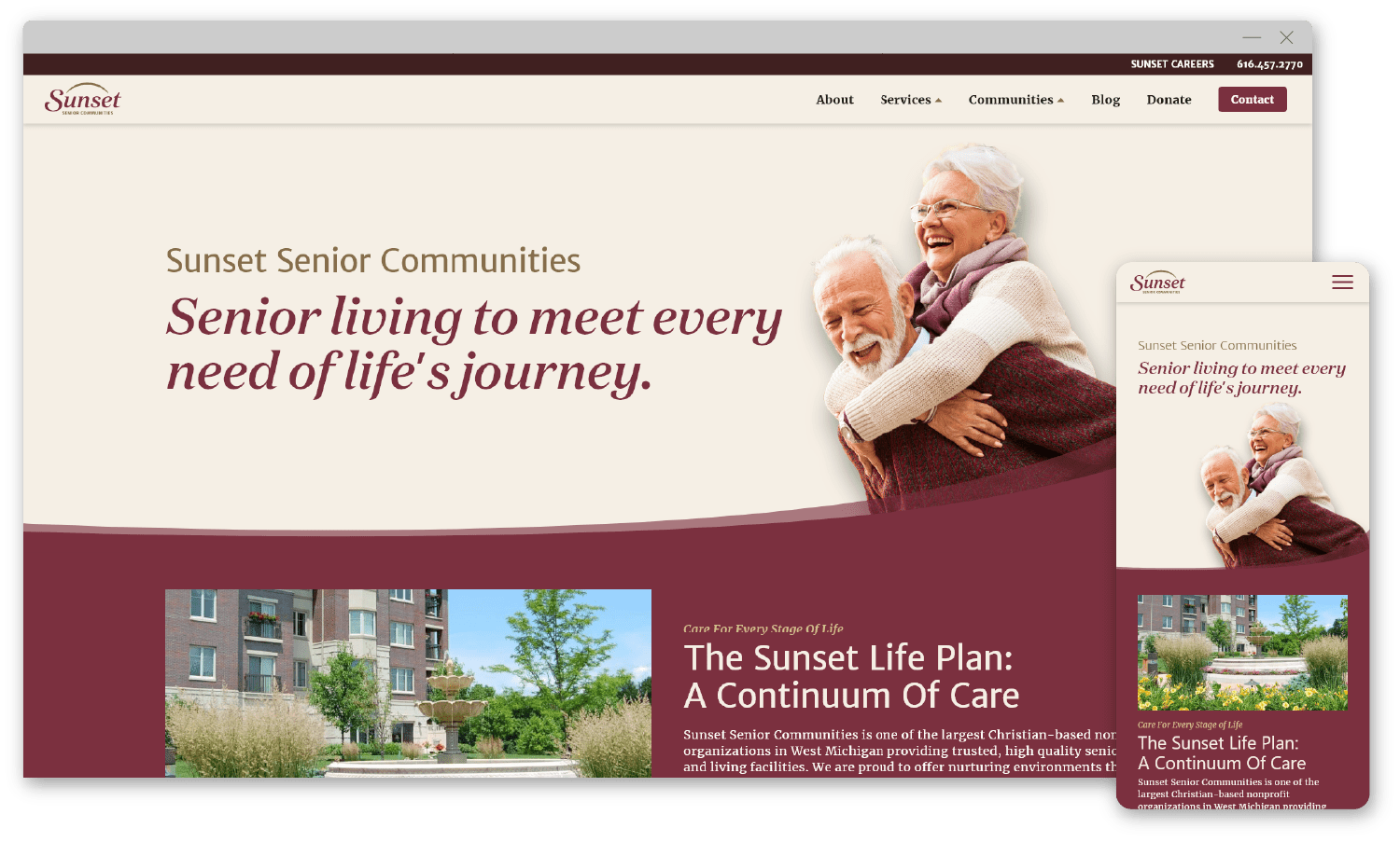
After the branding update was complete, we started rebuilding the website. The current website was very large. It provided a lot of information and multiple opportunities and methods for visitors to contact specific services at Sunset. But, it also used stock photography found on competitor websites and a wide range of colors not complementary to the brand. The sheer number of pages with duplicate content and links made it confusing to navigate and users would often get lost and leave the site.
Results
The new website was the first rollout of the updated Sunset name and brand. A lot of time was spent analyzing user paths, condensing duplicate content, and optimizing for performance. The results showed huge increases in website visitors, the number of sessions, and the number of pageviews.
%
increase in website visitors
%
increase in sessions
%

