Midwest Capital Advisors
All businesses need a visual brand update at some point. Often this accompanies other strategic or tactical changes at the company, like changes in management or building a new website. Both were the case with Midwest Capital Advisors, and they came to us to help them tell their story and stand apart from their competitors.

Visual Branding Update
We began our engagement with Midwest Capital as we often do, with a robust discovery process focused on identifying the key brand voice and messaging characteristics. The client’s primary ask was for a refresh of the logo. The lighter type was breaking up at small sizes and they were having issues maintaining consistent color across applications. We brightened and standardized the logo colors, tweaked the mark for better legibility at small sizes, and introduced two new brand typefaces with more utility and more modern sensibilities.
Brand Identity
Once the updates to the logo were decided upon, our team got to work on the rest of the visual brand identity. This included building a library of stock photography as well as taking our own photos of staff and the office. We created basic stationery items and documented all the identity updates, from logo usage to colors to typography styles, in a visual brand guide.

Custom Illustration
In an effort to further visually differentiate Midwest Capital from their competition, we proposed developing a series of illustrations that reflect the goals of their primary audiences. Illustration can be a great way to enhance a visual brand in an authentic and ownable way. Midwest Capital agreed, and we created a set of six illustrations that can be used across all media, from print to video. This element of their brand identity is unique to them in their market and elevates their presentation considerably.


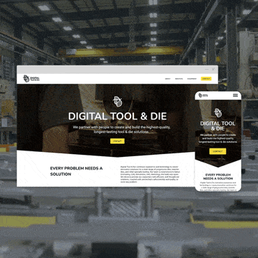
New Website
Midwest Capital’s old website was typical of many small to medium business sites that have been around for a few years; the design had become dated, it was difficult to update, and cumulative edits and additions to the site had made the navigation unwieldy.

We worked closely with their team to develop new content that better positioned them for SEO ranking and also more accurately reflected their brand voice. The new website is clean and focused, with strong typography, simple navigation, and colorful, positive imagery.


Results
It takes time to gather concrete data on the effectiveness of a new website, but so far the Midwest Capital site is showing significant increases in key performance metrics.
%
increase in new users
%
increase in sessions
%
increase in unique page views
%