1) Infographics are visually engaging and enjoyable
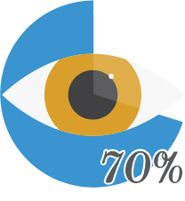
Out of all your sensory receptors, 70% are in our eyes.
People are visual creatures. With most of our sensory receptors being devoted to only one of our five senses, it’s not hard to see how that computes.
Researchers found that, if color visuals are present, the reader’s willingness to engage increases by 80%.
Because of our partiality to sight, we’re more eager to give our time to something that will be a visual feast. Shapes, colors, and patterns are things we enjoy whether they’re complex or simple.
People today receive about 174 newspapers worth of information each day. In 1986, we received 40 newspapers worth.
With such an overload of information coming at us, we become pickier about what we choose to give our attention to. If there are three articles with similar information but one has visuals, we’re likely going to go with that one because we know there’s at least one part we’ll likely enjoy.
Only 20% of the text on an average web page gets read.
Because we get inundated with so much more information, our attention spans have also decreased. Infographics increase the chance of extended engagement from a viewer.
2) Infographics are easy to quickly comprehend
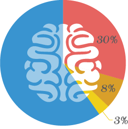
The average human brain’s involvement in visual processing is almost 30%.
Might not sound like a lot but when you compare it to 8% for touch and 3% for hearing, you see that there’s a lot going on when it comes to visual processing.

Everything from furniture to lighting to bystanders queues us into exactly what situation we’re seeing. If you see a stage and large crowds, you know there’s going to be a show of some sort. A dark and dirty room may give us a sense of danger. And a cake on the kitchen counter means there’s probably a celebration going on.
If directions have both text and illustrations, people do 323% better than if directions are text only.
Not only do we enjoy visuals, they help us understand what to do in directions. Why do you think cooking shows and those 60-second Buzzfeed How-To videos are so popular?


