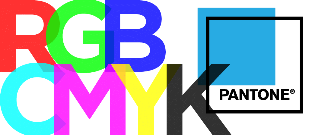
If you’ve ever worked with a designer or a printer, chances are you have heard the term “CMYK”. Chances are you also nodded and smiled with no idea what they were talking about. Well, I’m here to tell you about CMYK, RGB, and Pantone, and why these color systems are so important to designers.
1. CMYK Color System
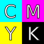
CMYK is a four-color printing process using Cyan, Magenta, Yellow, and Key (Black). You can probably picture yellow and magenta but cyan is a light, almost neon, blue often used as a “standard” color in old drawing programs like Microsoft Paint or a highlight color in Word called “turquoise”. (That’s cyan, Word, you’re not fooling anyone.)
 The K stands for Key because the printing plates used in old four-color printing were aligned according to the black plate, or the Key. At least, that’s the most commonly accepted answer. There are conflicting answers, most having to do with how things worked when the CMYK printing process was still very new.
CMYK is a subtractive color process which means every color is the result of partially or completely subtracting (that is, absorbing) some wavelengths of light and not others. Basically, “mix certain amounts of colors to make other colors.” You’ll see CMYK when shopping for ink cartridges, on fast-food bags, or when looking at vintage comics. The little dots making up the image are nothing more than overlapped portions of cyan, magenta, yellow, and black.
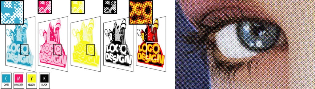
Printers have become much more advanced with a greater threshold for detail, so you won’t see those dots as often now. Any printed item you come across still uses CMYK, it’s just much harder to make out the telltale dots.
2. RGB Color System
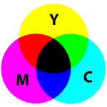
RGB (red, green, blue) is the color system used on things like computer screens and phone screens. This color system uses an additive color process. It’s called such because various amounts of red, green, and blue light are added together to create new colors (16.7 million of them, actually).
 One way to easily understand additive vs. subtractive color processes is to think about what happens when colors are mixed together. When putting heavy amounts of cyan, magenta, and yellow together, the results get darker just from physically putting more and more ink on the paper. Making lighter colors requires less ink.
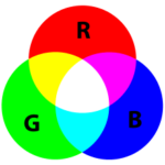 On the flip side, additive color deals with light and is based on our human perception of colors. Think about a prism. When light comes in the right way, it creates a rainbow. In reverse, the more you put red, green, and blue (and the secondary colors they make) together, the lighter a color becomes.
The RGB color system is a little harder to spot with the naked eye. However, you’ve probably seen it if you’ve ever put your face extremely close to an older computer, watched a video with a screen in it that seems to be doing the wave, or looked closely at an electronic billboard.
![]()
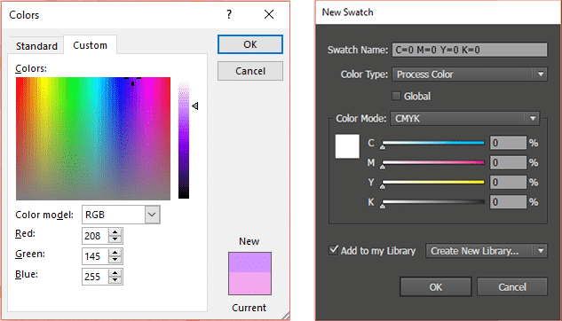
Both CMYK and RGB use color codes. If you have Microsoft Word and have ever wanted to change a font color, you may have seen a box with a rainbow that fades to gray and noticed a few boxes below that. These three boxes, red, green, and blue, have numbers ranging from 0 to 255. The numbers represent how much of each base color is going into the color you’re creating. For example, if all three boxes have 255, the resulting color is white.
Working with CMYK color codes is a little less accessible. Adobe Illustrator (which is a fancy-pants version of Microsoft Paint), lets you create a CMYK document prepped to be printed rather than viewed on a screen. This ensures the printed result will be much closer to what your screen is showing than if it were in RGB. CMYK color codes are set in terms of percentage rather than 0 to 255. To get white out of CMYK, all four colors must be at 0%.
3. Pantone Color System
If you’ve visited an art museum gift shop or an artsy store like Blick, you may have seen Pantone products. They make accessories like iPhone cases, journals, and mugs, all with patented Pantone color blocks, the word “Pantone”, and a color code.
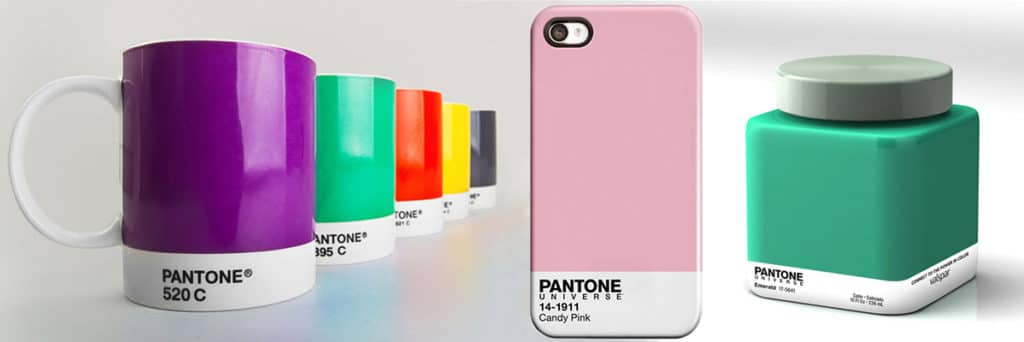
So what is this color-making conglomerate? Pantone has become a regular in the design world due to its Pantone Matching System (or PMS). This system is Pantone’s way of ensuring any color is the same, no matter where you see it. For example, Pantone 300 (a shade of blue) will be the same whether it’s in fabric, on a mug, on a poster, paint on your walls, or the flag of Scotland.
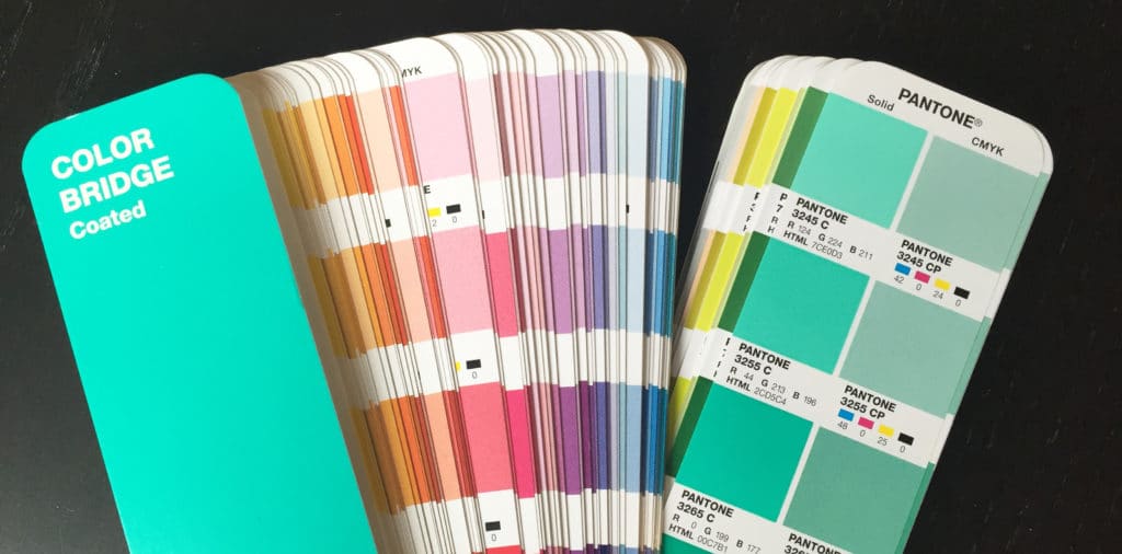
Pantone colors are patented because of Pantone’s Hexachrome color system. It’s a similar system to CMYK except it also uses orange and green in the base colors. This makes matching Pantone colors to CMYK colors very difficult to replicate.
Pantone also produces color swatches specifically for this purpose (as part of its PMS). These swatches show a Pantone color, the code, the RGB code, the HTML code, and the CMYK equivalent. As you might be able to see in the picture, the CMYK translation doesn’t quite get to Pantone’s Hexachrome level.
Creating Your Brand Identity With DVS
These three color systems are part of a designer’s bread and butter. Knowing their differences is essential in creating everything from a solid brand identity to professional-looking finished products.
At DVS, we use various elements (colors, fonts, logos, messaging) to create brand identities designed to tell your story and form connections with your target audience. Contact us to learn more about developing or improving your brand identity.